
WBS - Part 2 - Data Visualization(Public Sector: Defense & arms trade)
January 31, 2016
In part 1 we did some cleaning and data manipulation , now let make some good used of that data.
In last tutorial we had 1477 row of data of Public Sector: Defense & arms trade--(topic).
Lets built some visualization that is interesting and lucid.
We will make google motion chart (like Hans) and dashboard in Tableau.
This data.frame is still not ready as input for visualization. Lets make it.
Things to remember
1. Always make date in narrow format, it will make many thing easy for all type of visualization(pivot table, tableau , motion chart), as date are mostly used as filter, its a good practices.
2. Expand those factors which can be made into individual column and we can analysis each column separately (like indicator name here, we can make column of each indicator so that we can analysis only one indicator at a time). This will give as more flexibility for analysis. This is good practices in any type of analysis (pivot, tableau, others)

One important requirement of google motion chart is it need one variable as date, so lets make years to data variable in r
Now we are ready
Few function input has to be define other can be change from chart itself gvisMotionChart -- parameters
This is the plot you will get as output: Public Sector: Defense & arms trade.html
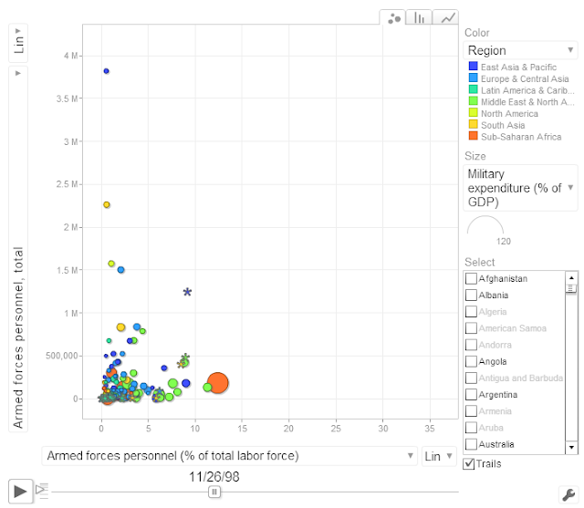
Play around with it, change axis, color, size var as you like.
This is format of data used for google motion chart (same file will be used to make tableau dashboard, and you can even use it to make pivot table)

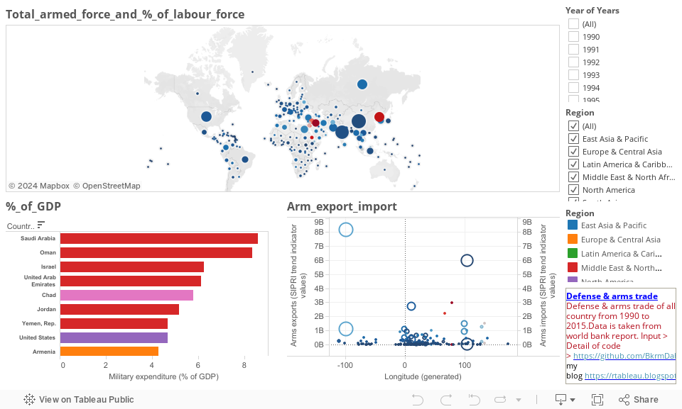
Tableau
Import the saved file to Tableau and change the format of all numerical filled to numeric ( as data has NA these field will be marked as text by tableau). You can download the workbook from Military_Expenditure(Defense arms trade) and follow along.
In last tutorial we had 1477 row of data of Public Sector: Defense & arms trade--(topic).
Lets built some visualization that is interesting and lucid.
We will make google motion chart (like Hans) and dashboard in Tableau.
This data.frame is still not ready as input for visualization. Lets make it.
Things to remember
1. Always make date in narrow format, it will make many thing easy for all type of visualization(pivot table, tableau , motion chart), as date are mostly used as filter, its a good practices.
2. Expand those factors which can be made into individual column and we can analysis each column separately (like indicator name here, we can make column of each indicator so that we can analysis only one indicator at a time). This will give as more flexibility for analysis. This is good practices in any type of analysis (pivot, tableau, others)

| ####lets gather all data into narrow form wdi_sub = gather(wdi_sub, "years", "sample", 4:59) | |
| #### Rename for easy handling | |
| colnames(wdi_sub) <- c("Indicator.Name", "Country.Name","Region" ,"years", "Value") | |
| #### lets put indicator name in column name | |
| wdi_sub = dcast(wdi_sub, Country.Name+years+Region~Indicator.Name, value.var = "Value", na.rm = T ) |
One important requirement of google motion chart is it need one variable as date, so lets make years to data variable in r
| ||
| wdi_sub$years=as.Date(wdi_sub$years, "%Y-%m-%d") |
Now we are ready
Few function input has to be define other can be change from chart itself gvisMotionChart -- parameters
| ||
| options = list(width = 700, height = 600), chartid= "country_gdp") | ||
| plot(M) | ||
| ###save file | ||
| setwd(filepath) | ||
| dir.create("Output") | ||
| setwd(paste(filepath, "Output", sep="/")) | ||
| write.csv(wdi_sub, file="Public Sector: Defense & arms trade.csv") | ||
| setwd(filepath) | ||
| rm(list=ls()) |
This is the plot you will get as output: Public Sector: Defense & arms trade.html

Play around with it, change axis, color, size var as you like.
This is format of data used for google motion chart (same file will be used to make tableau dashboard, and you can even use it to make pivot table)

Tableau
Import the saved file to Tableau and change the format of all numerical filled to numeric ( as data has NA these field will be marked as text by tableau). You can download the workbook from Military_Expenditure(Defense arms trade) and follow along.


1 comments
This article is amazing it has very useful information in it.
ReplyDeleteget all the help you need to pass the tableau exam through best tableau certification dumps